

Input controls are the interactive components in your app's user interface. Android provides a wide variety of controls you can use in your UI, such as buttons, text fields, seek bars, check box, zoom buttons, toggle buttons, and many more.
UI Elements
A View is an object that draws something on the screen that the user can interact with and a ViewGroup is an object that holds other View (and ViewGroup) objects in order to define the layout of the user interface.You define your layout in an XML file which offers a human-readable structure for the layout, similar to HTML. For example, a simple vertical layout with a text view and a button looks like this −
<?xml version="1.0" encoding="utf-8"?>
<LinearLayout xmlns:android="http://schemas.android.com/apk/res/android"
   android:layout_width="fill_parent"
   android:layout_height="fill_parent"
   android:orientation="vertical" >

   <TextView android:id="@+id/text"
      android:layout_width="wrap_content"
      android:layout_height="wrap_content"
      android:text="I am a TextView" />

   <Button android:id="@+id/button"
      android:layout_width="wrap_content"
      android:layout_height="wrap_content"
      android:text="I am a Button" />
</LinearLayout>
Android UI Controls
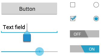
There are number of UI controls provided by Android that allow you to build the graphical user interface for your app.| Sr.No. | UI Control & Description |
|---|---|
| 1 |
TextView
This control is used to display text to the user. |
| 2 |
EditText
EditText is a predefined subclass of TextView that includes rich editing capabilities. |
| 3 |
AutoCompleteTextView
The AutoCompleteTextView is a view that is similar to EditText,
except that it shows a list of completion suggestions automatically
while the user is typing. |
| 4 | Button
A push-button that can be pressed, or clicked, by the user to perform an action. |
| 5 | ImageButton An ImageButton is an AbsoluteLayout which enables you to specify the exact location of its children. This shows a button with an image (instead of text) that can be pressed or clicked by the user. |
| 6 | CheckBox
An on/off switch that can be toggled by the user. You should use
check box when presenting users with a group of selectable options that
are not mutually exclusive. |
| 7 | ToggleButton An on/off button with a light indicator. |
| 8 | RadioButton
The RadioButton has two states: either checked or unchecked. |
| 9 | RadioGroup A RadioGroup is used to group together one or more RadioButtons. |
| 10 | ProgressBar
The ProgressBar view provides visual feedback about some ongoing
tasks, such as when you are performing a task in the background. |
| 11 | Spinner
A drop-down list that allows users to select one value from a set. |
| 12 | TimePicker The TimePicker view enables users to select a time of the day, in either 24-hour mode or AM/PM mode. |
| 13 | DatePicker The DatePicker view enables users to select a date of the day. |
Create UI Controls
Input controls are the interactive components in your app's user interface. Android provides a wide variety of controls you can use in your UI, such as buttons, text fields, seek bars, check box, zoom buttons, toggle buttons, and many more.As explained in previous chapter, a view object may have a unique ID assigned to it which will identify the View uniquely within the tree. The syntax for an ID, inside an XML tag is −
android:id="@+id/text_id"To create a UI Control/View/Widget you will have to define a view/widget in the layout file and assign it a unique ID as follows −
<?xml version="1.0" encoding="utf-8"?>
<LinearLayout xmlns:android="http://schemas.android.com/apk/res/android"
   android:layout_width="fill_parent"
   android:layout_height="fill_parent"
   android:orientation="vertical" >

   <TextView android:id="@+id/text_id"
      android:layout_width="wrap_content"
      android:layout_height="wrap_content"
      android:text="I am a TextView" />
</LinearLayout>
Then finally create an instance of the Control object and capture it from the layout, use the following −
TextView myText = (TextView) findViewById(R.id.text_id);
Tags:
Tutorial